Voters may perceive fonts in campaign communications to have liberal or conservative leanings
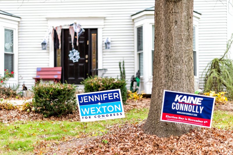
Yard signs for a local politician captured the curiosity of Katherine Haenschen.
“I was driving through the region and noticed the same campaign was using a different font on signs in rural areas than on the signs in town,” said Haenschen, an assistant professor in the Department of Communication. “I thought, why would this candidate be using multiple fonts?”
An expert in political messaging, Haenschen and Daniel Tamul, also an assistant professor in the Department of Communication, transformed the question into a captivating research project.
“What’s in a Font?: Ideological Perceptions of Typography” questions the potential impact on voters if fonts are found to have political attributes.
Haenschen and Tamul reached the following key conclusions through the study:
- Individuals perceive fonts to have liberal or conservative leanings.
- The more people view a font as aligned with their ideology, the more they favor it.
- Fonts that fall under the serif category — ones festooned with a small line or stroke — are viewed as more conservative than fonts in the sans serif group, though differences exist within font families.
“This research is of interest to anyone who cares about political communications, and the results have clear implications for political campaign professionals,” said Haenschen. “When you’re choosing a candidate’s visual identity, you need to consider how people perceive that font.”
The findings came from two survey experiments. The first used typeface classification, such as serif or sans serif, and typeface styles (regular, bold, italic).
A total of 987 survey participants read the phrase “the quick brown fox jumped over the lazy dog” presented in each typeface style, and two typefaces representing the serif and sans serif categories: Times New Roman and Gill Sans.
The respondents then rated the typeface as liberal or conservative, and answered several demographic measures related to their political ideology, party affiliation, age, gender, and race.
During the second experiment, Haenschen and Tamul used a wider range of typefaces, including multiple typefaces within the same font family.
Participants read a phrase or a name written in one of two serifs (Jubilat or Times New Roman), one of two sans serifs (Gill Sans or Century Gothic), and one display font (Sunrise, Birds of Paradise, or Cloister Black Light).
The researchers said they chose the Jubilat font because it was used in Sen. Bernie Sanders’ 2016 presidential bid, and Century Gothic because of its close approximation to the Gotham font used by former President Barack Obama during his 2008 campaign.
Overall, results showed that typefaces, typeface classifications, and typeface styles are perceived to have different ideological leanings, and partisanship moderates ideological perception.
Haenschen emphasized that the exploratory story suggests many avenues for further research.
“This study shows that font plays a role in American political communication, conveying ideology through the anatomy of its letterforms,” said Haenschen. “Through this research, we lay the groundwork for future studies that may identify relationships between fonts and persuasive outcomes in political communication.”
Read more about the research project here.
—Written by Andrew Adkins